
Colors play a powerful role in how people perceive brands, advertisements, and printed materials. In printing and graphic design, color psychology is used to influence emotions, attract attention, and create strong brand recognition.
Choosing the right colors in printed materials such as brochures, posters, packaging, and business cards can significantly impact how customers respond to your brand.
🎨 What Is Color Psychology in Printing?
Color psychology refers to how different colors affect human emotions, behavior, and decision-making. In printing, colors are strategically selected to communicate a brand message and create visual impact.
For example, bright colors may grab attention, while soft tones can convey trust and calmness.
📌 Why Color Psychology Matters in Print Marketing
1️⃣ Creates Strong First Impressions
Printed materials often represent the first interaction customers have with your brand. The right color combination can instantly make your design more appealing and memorable.
2️⃣ Improves Brand Recognition
Consistent use of brand colors across:
- Business cards
- Flyers
- Brochures
- Packaging
- Corporate stationery
helps customers easily identify and remember your business.
3️⃣ Influences Customer Emotions
Colors trigger emotional responses that can influence purchasing decisions.
For example, warm colors create excitement, while cool colors build trust and stability.
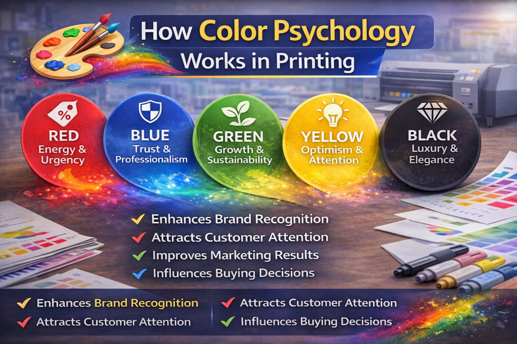
🌈 Meaning of Popular Colors in Printing
🔴 Red – Energy & Urgency
Red attracts attention and creates excitement. It is commonly used for:
- Sale posters
- Food promotions
- Clearance offers
🔵 Blue – Trust & Professionalism
Blue represents reliability and professionalism.
Often used by:
- Corporate companies
- IT businesses
- Financial institutions
🟢 Green – Growth & Sustainability
Green symbolizes nature, freshness, and eco-friendliness.
Perfect for:
- Organic brands
- Environmental businesses
- Health products
🟡 Yellow – Optimism & Attention
Yellow is bright and energetic, often used to highlight offers or promotions.
⚫ Black – Luxury & Elegance
Black gives a premium and sophisticated feel.
Commonly used in:
- Luxury packaging
- High-end business cards
🖨 Color Tips for Printing
✔ Use high-contrast color combinations for readability
✔ Maintain brand color consistency across all prints
✔ Avoid using too many colors in one design
✔ Choose CMYK-friendly colors for accurate printing results
📈 Business Benefits of Using Color Psychology
Using the right colors in printed materials can:
✔ Increase brand recognition
✔ Improve marketing effectiveness
✔ Attract customer attention
✔ Influence buying decisions
✔ Strengthen brand identity